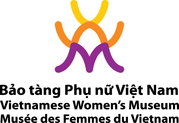
VWM Logo – An Effective Communication Tool
Logo is important for branding of an organization and an effective tool for marketing to the public. For this reason, to promote and market itself, the Vietnamese Women’s Museum has developed its new logo representing its own identity, showing the full significance of the brand name “Vietnamese Women’s Museum” and contributing to developing its new image: dynamism, modernity and professionalism.
In the trend of internationalization, using English as a common language of communication worldwide, the Vietnamese Women’s Museum takes the abbreviation of its name in English – VWM for its logo design. The three letters VWM are structured and arranged vertically and stylized in an artistic way, creating a round block and making the logo firm and beautiful while maintaining its suppleness and feminity. The logo was designed based on basic colours used in the graphics of the museum’s permanent exhibitions. The three abbreviation letters are presented in three colours –violet, red and orange in the principle of mixing to different colour levels. Under the three letters VWM is the name of the museum in three languages: Vietnamese, English and French – Bảo tàng Phụ nữ Việt Nam, Vietnamese Women’s Museum, and Musée des Femmes du Vietnam
When using the new VWM logo, some principles must be applied: Only the original logo designed by Patrick Hoarau and decided by the VWM leaders is used. Thus, the new logo is symbolized by the museum’s abbreviation name VWM in Miriad Pro/Bold white, using Pantone. The full name of the museum is written in three languages: Vietnamese, English and French. The logo colours must be used exactly. The logo must be placed in the context relating to VWM activities. It cannot be used without agreement from the Vietnamese Women’s Museum.

However, during using the logo for each product, the overall logo design must be kept while the name of the museum in three languages can be presented flexibly. Depending on each background colour on which the logo is placed, corresponding and suitable colours should be used.


 Đào Lê Thanh

Leave a Reply